top of page
Moonpig Rebrand
Changing the perception of an £85m.com company.
In 2017 the UK's biggest online greeting cards company needed to separate itself from novelty copycats and appeal to a more sophisticated market, all while maintaining the known sense of wit and charm. The pig was dead and life was lived more lightly on the moon, with the ambition of bringing Moonpig into the vernacular with ‘Share a moment, share a Moonpig’.
Font collaboration with F37 | Photographer Aleksandra Kingo | TV spots Quiet Storm |
Working alongside creative teams James Turner + Phil Dudman + Ian Styles + Stuart Hammersley


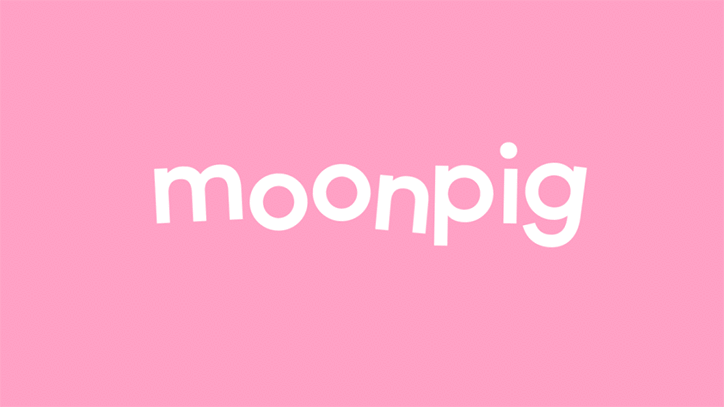
The logotype is playfully designed to compress down to form a subtle reference to the original pig's snout in small spaces and extend out to allow play with horizontal formats and interact with the new TV jingle.
The team worked extensively with British based type company F37 Foundry to create and develop a custom bespoke type family that would play a key role in Moonpig's new brand identity creating a new Demi weight called Moonpig Lift-Off.
This weight features 3 styles of alternates with random programming, giving it a playful yet structured execution. It consists of 4 subclasses: a regular class for the normal design of the characters, one class for the ‘lift’ characters, another class for the ‘wobbly’ characters and one for the more complex group of characters — those that ‘shake’.
A method called ‘Quantum’ was used for the programming. This allowed for a higher degree of randomness, which is defined by the amount of characters affected within a certain group of characters and level of substitution.


The photography is as much about the essence of Moonpig as it is about the product. Unexpected comic twists, surreal gradient light, tonal pop colours. This allows us to show Moonpig’s distinctive sense of heartfelt humour.
Product styling is minimal and gives a sense of anticipation and energy. Lighting express' quality and presents Moonpig products in a playful character using bold, bright colours from the brand pallet. Slightly odd angles and image manipulation achieve a surreal exciting effect.
Photography by Aleksandra Kingo | Set by Elena Mora | Styling by Amy Friend


1/1
The in-house team picked up a picked up a D&AD award and the rebrand was project was selected in the Design - Brand Identity category in The Annual 2018 in Creative Review, was highly acclaimed in the Design Week, The Drum and It's Nice That.


bottom of page